Web design
Your brokerage site is a listing pitch you are not in the room for.
Almost nobody arrives at a brokerage website with an open mind. They arrive holding a name: a referral gave it to them, a sign call sent them, an email signature linked them there. The site is not introducing your firm. It is confirming, in about ninety seconds, that hiring you is a decision somebody can defend to a partner. Most brokerage sites are built as though the opposite were true, which is why they read like a capabilities brochure and convert like one.
Four people load this site, and none of them are browsing
Every design decision gets easier once you name the visitors. In our experience there are four, and each one arrives with a task already in mind.
- An owner between the referral and the meeting. Somebody gave them your name last week and the pitch is Thursday. They want to know what you handle, where, for whom, and what your marketing actually produces. They will spend fifteen minutes and they will do it before you ever speak.
- A tenant rep verifying a listing. They found the space on a portal and they are checking whether the firm behind it is real, whether the availability is current, and who to call. This visit lasts under a minute and it is the one most sites handle worst.
- A broker considering a move. Recruiting happens on the team page whether or not you designed it to. Candidates are reading for platform, not for culture language.
- A client you already have. They are forwarding something to a lender, a partner, or a spouse. Every link you make hard to send is a conversation you have to have twice.
Notice that only one of the four is a stranger discovering you. That changes the brief. The homepage does less work than firms assume, and the listing pages, the bios, and the proof do more.
The listings section is the site
Listings are the only part of a brokerage website that changes, that other sites link to, and that a stranger has a reason to visit twice. Treat them as the product and the rest of the site gets simpler.
The first structural decision is that every available space gets a real URL. A listings page that lists properties and hands off a PDF is a dead end: a downloaded copy will not change when the listing changes, and the visitor still needs a clear way to inquire. Public PDFs can be indexed, but the current listing facts and contact should also be available on the property page. The suite is the unit, not the building, for the same reason a center with one inline vacancy and one pad should say exactly that rather than publishing a single blended paragraph. We wrote out the case for giving a real campaign its own address in single-property websites.
The second is that availability carries a date. A list without a last-updated stamp is read as stale by default, and it usually is. When the portal listing, the flyer, and the website each hold their own copy of the same facts, they drift within weeks, and the drift is visible to precisely the people you did not want catching it. The maintenance discipline is the same one described in portal listing hygiene.
The third gets skipped almost universally: decide what happens when a deal closes. Deleting the page throws away every inbound link, every portal referral, and the search history the listing accumulated over eight months. Mark it leased or sold, keep the page, and let it point to what else is available in that submarket. A firm with four years of closed listings still published has a submarket archive that no competitor can copy, and a new owner searching a corridor will find it.
Then route the inquiry. The form should carry the property and the suite the prospect was looking at, and it should reach the listing broker directly rather than a shared address that nobody owns after five. A generic contact form on a listing page is a lead you paid for and then made somebody re-explain.
The people pages outperform the homepage
Owners hire people. The bio page is usually the second page visited and the last one written, and it is almost always a paragraph of adjectives attached to a headshot taken at a different studio than everyone else's. The fix is not more words. It is specifics an owner can check: product types, submarkets, representative assignments, years in the corridor, direct line, license number. We covered what separates a bio that wins work from one that fills a grid in broker bios that win business.
One practical note for California firms. Business and Professions Code section 10140.6, together with the Department of Real Estate's implementing regulation, requires license identification on solicitation materials at first point of contact. Build that into the footer and bio templates once rather than pasting it onto pages later.
What an owner is looking for and usually cannot find
Sit with a landlord while they research a firm and the same three questions come up, none of which most brokerage sites answer.
What do you actually handle. Product type and geography, stated narrowly enough to be believed. "Full service, nationwide" reads as no specialty at all. A firm that says it leases neighborhood retail in south Orange County and shows six centers to prove it is more credible than a firm claiming every asset class in the state.
What the marketing includes. This is the question that decides listing pitches, and the website is where it should already be answered: photography, site plan, trade area data with sources, a property page, a flyer, the email campaign, the portal placement, and who produces each. Firms describe this verbally in a conference room and then publish nothing about it. The reasoning behind putting deliverables in front of an owner in writing is in what belongs in a leasing pitch.
What you did for somebody with the same problem. Not a logo wall. One page per representative assignment, with the situation, what shipped, and the outcome you are permitted to disclose. Two honest case pages beat forty client logos, and they are the pages an owner forwards to a partner.
The property sites are where a pitch becomes evidence
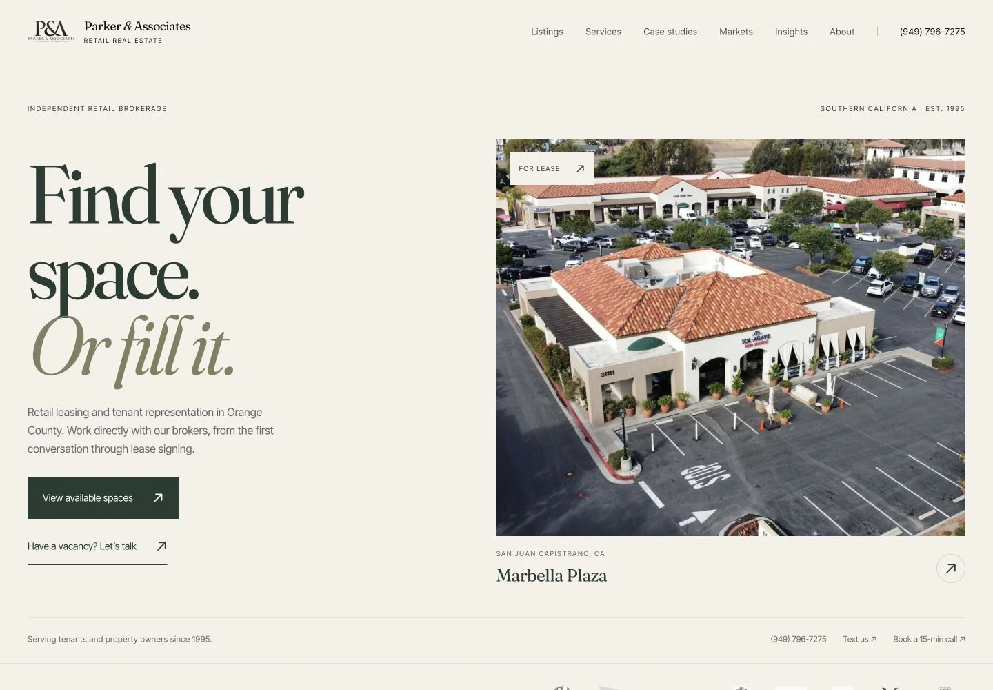
Our own published work is the argument for this structure. Marbella Plaza is a 66,124 square foot grocery-anchored center in San Juan Capistrano, and its site is built so that every suite on the plan connects to its own square footage, status, and photography. When a suite leases, one record changes and the plan, the availability list, and the flyer all move together. That is what makes the page trustworthy nine months into an assignment rather than accurate only on launch day. The Marbella case study covers how it is assembled.
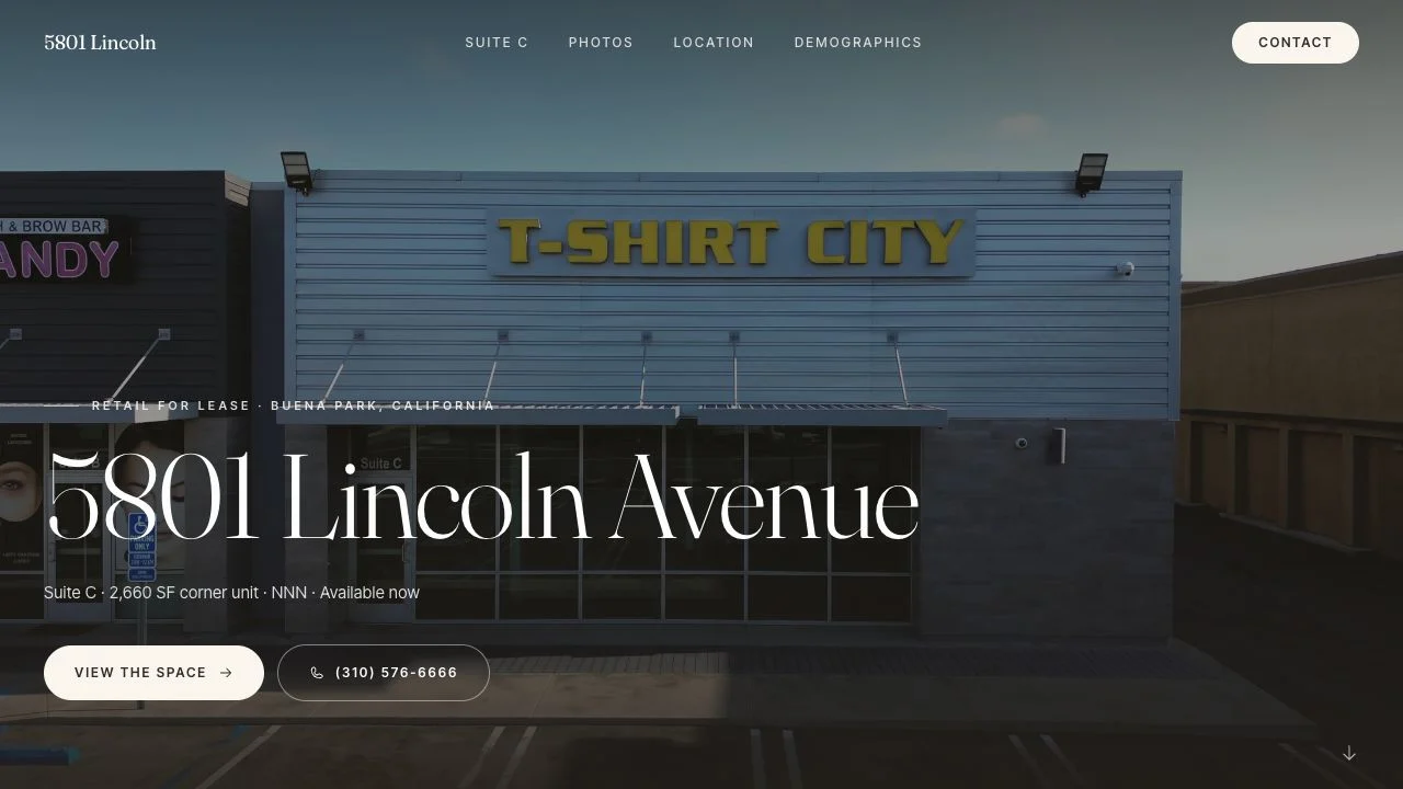
The other end of the range is 5801 Lincoln, a 2,660 square foot corner suite in Buena Park taken from brief to live in three days, with a seven-page flyer generated from the page's own design system so the attachment and the link never disagree. The listing is represented by Ken Simon at KFS Properties. The Lincoln case study has the day-by-day.
An owner does not hire a brokerage for its homepage. They hire it after seeing what the firm published for somebody else's building.
For a brokerage site, the lesson is architectural. The firm site is the hub, and each assignment worth a real campaign gets a plain, permanent path on the firm's domain. Short paths survive a rebrand, print legibly under a QR code on a leasing sign, and can be read aloud on a call. Nothing about that decision is visual, and it outlives most of the design choices around it.
The plumbing that decides whether any of it gets read
Three mechanics do more for a brokerage site than any redesign.
Speed on a phone. Half of these visits happen in a car. Google's Core Web Vitals thresholds, published on web.dev, treat a Largest Contentful Paint of 2.5 seconds or less at the 75th percentile as good. Most brokerage sites fail on unoptimized hero photography alone, which is a production problem rather than a design one. The measurement method is in page speed for property websites.
Search that matches how people actually look. Nobody types your firm name unless they already have it. They type the submarket and the product: retail space for lease in a named city, industrial building for sale in a named corridor. Your listing pages and submarket pages are what compete for those queries, not your About page. The practical version is in SEO for commercial real estate.
Somebody owning the updates. The most common failure we see is not an ugly site. It is a good site with a 2023 availability list, because the person who could edit it left the firm. Ask any prospective vendor how a new vacancy goes live and who does it. If the answer involves a support ticket, assume the list will be wrong within a quarter.
If the budget only covers one phase
Build the listings system first, including the property page template, the availability structure, and the routing. It is the part that gets used daily, earns search traffic, and gives every email and sign a destination. Bios come second. The firm narrative, the service pages, and the photography of the office come last, and the firm will be fine without them for a season.
What we would skip in a first phase: a blog nobody is staffed to write, a map search built over twelve listings, stock photography of a skyline in a city you do not work in, and any feature whose demo requires a login. Ranges for what all of this costs, and what drives the number, are in what a commercial real estate website costs, and the way we scope a build is described in our services.
A useful test before you commission anything: open your current site on your phone, standing outside, and try to answer one question as an owner would. What has this firm leased in my submarket in the last two years, and who would handle my building. If you cannot get there in three taps, the problem is not the typography.
Work with Endcap Design
Brokerage website design
We design and build brokerage websites with property listings, team pages, company information, and inquiry forms.
Included
- A page for each listing with its size, rate, photos, plan, brochure, and broker contact
- Team pages and company information
- Inquiry forms, content migration, redirects, and launch checks
Typically a few weeks, depending on content, migration, and approvals
We reply within an hour during business hours, and we only use your details to answer you.
Get a quote for your brokerage websiteOr call or text Noah at (425) 233-0769
See the full service ↗Contact Endcap
START A
project.
A website, a brand, or a complete set of materials.
We reply within an hour during business hours, and we only use your details to answer you.
Start a project or call or text Noah at (425) 233-0769