Services · Brand
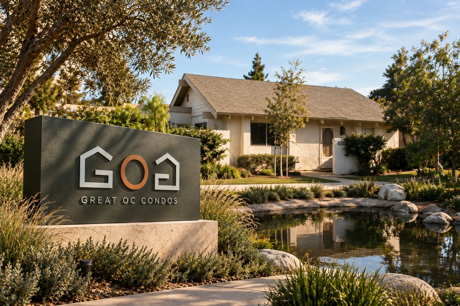
Property naming, marks, and signage.
A center gets named once and then lives with it for twenty years, on the monument sign, the lease documents, and every flyer that goes out. Worth spending a week on.
What we produce
- Property naming. A shortlist with the reasoning, checked against what else is trading under similar names in the market, and against what the domain situation looks like.
- Logo and mark. The property mark itself, in the variations you'll actually need — horizontal, stacked, single color, and small enough to survive a favicon and a sign band.
- Signage design. Monument and pylon layouts, tenant panel systems, and wayfinding, produced as artwork and specifications your sign contractor can build from.
- Leasing signage that matches the building. The "FOR LEASE" panel is usually the ugliest object on a nice property — a stock red-and-white banner bolted to a Spanish Colonial arcade. We design the leasing sign to the center's own architecture, so it markets the space without undoing the curb appeal you paid for.
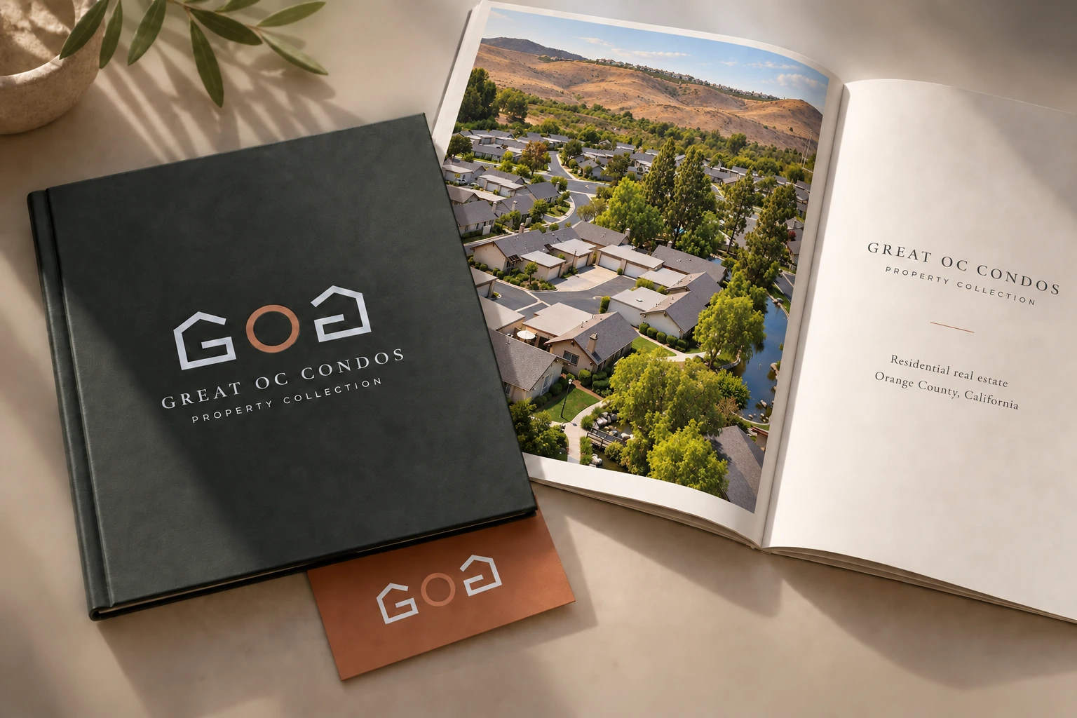
- Leasing collateral system. The flyer, brochure, and site-plan formats that follow from the identity, so the next availability doesn't get designed from scratch.
- Brokerage identity. The same work at firm level, when the brokerage itself needs the mark rather than a single asset.
Where naming earns its keep
Naming matters most when the property has to say something the address doesn't. A repositioned center with new anchors, a mixed-use project that needs to read as a destination rather than a building, a development being pre-leased before there's anything to look at. In those cases the name is doing real work — it's the first thing in the flyer headline and the only thing a tenant rep remembers from the call.
It matters least when the corner already has an identity. If everyone in the trade area calls it by the cross street, a clever new name can cost you recognition you already own. We'll say so rather than sell you a rename.
The leasing sign nobody wants to look at
Most vacancy signage is ordered from whoever prints banners. It arrives in stock red and white, in a typeface chosen by nobody, and it gets zip-tied to the most visible elevation on the property. On a tired strip center that is a wash. On a Spanish Colonial center with clay tile, arched openings, and a courtyard, it actively costs you — a prospective tenant reads it as a property that has stopped caring, which is exactly the wrong impression while you are trying to lease.
A leasing sign drawn to the building's own language does the same job without the damage: cream stucco ground, an arched panel that echoes the arcade, engraved caps, and the phone number still legible from the drive aisle. It costs about the same to fabricate. The difference is entirely in whether anyone designed it.
Signage is where brands go to die
The most common failure isn't the logo — it's that the mark was designed on a screen and never tested at sign scale. Tenant panels are small, monument bands are wide and short, and a lot of type that looks refined in a PDF turns to mush at forty feet in the sun. We design against the physical constraints from the start, and we produce the tenant panel system rather than leaving each incoming tenant to improvise.
How it works
- Brief. The asset, the repositioning if there is one, the tenant mix you're targeting, and any existing firm brand it has to sit inside.
- Direction. Names and marks with the reasoning, not a wall of options. You pick a direction and we refine it.
- Application. The mark applied to signage, collateral, and the listing site, delivered as working files plus specifications for your fabricator.
How the work runs
Naming starts with constraints, not brainstorming. What the property is called on the deed, what the neighborhood already calls the corner, what is trading under a similar name within a few miles, and whether a matching domain exists. That pass eliminates most candidates before anyone gets attached to one.
You get a shortlist with reasoning attached — why each name works, what it risks, and what it will look like on a monument band. Not thirty options to pick from. Thirty options is a way of making the client do the work.
What we need from you
- The positioning. Who the center is for after the repositioning, and which tenants you are trying to attract. A name aimed at a grocery-anchored neighborhood center is a different object from one aimed at a lifestyle project.
- Any constraints already in place. Signage the city has approved, a ground lease that names the property, an anchor with brand requirements of its own.
- Your sign contractor. Early, not late. They will tell us the panel dimensions and illumination method, and those numbers change the design.
What you get
The mark in every variation you will actually need — horizontal, stacked, single color, reversed, and small enough to survive a favicon and a tenant panel. Monument and pylon layouts as artwork plus specifications your fabricator can build from. A short style guide covering type, color, and spacing, so the next flyer does not drift. And the collateral formats that follow from it.
What we do not do
We do not fabricate, permit, or install signage. That is a sign contractor's job and they are better at it than we would be. We produce the artwork and the specs and work alongside whoever you use.
Common questions
When is it worth renaming a center?
At a change of ownership, a repositioning, or when the current name carries something you're trying to move past. Rarely worth doing on its own.
Do you handle physical signage?
We design it and produce the artwork and specs. Fabrication, permitting, and installation sit with a sign contractor, and we work alongside them.
Can you match an existing brokerage brand?
Yes — most property marks have to co-exist with the firm logo across flyers, signage, and the site.
Related reading: naming and branding a shopping center and leasing signs that actually get scanned.