Insights
Commercial real estate branding: what actually differentiates a firm.
Squint at fifty brokerage brands and you'll see the same one: a navy-and-gray logo, a skyline photo, and the words "full service." Branding in CRE isn't a logo problem — it's a commitment problem. Here's what differentiation actually requires, and where design fits in.
Why CRE brands all look the same
Because sameness feels safe. Firms sell trust with large sums, so everyone reaches for the visual shorthand of institutional credibility — navy, serif, skyline — and lands in identical territory. The irony: when every firm signals "safe" the same way, the signal carries no information, and the choice between firms falls back to relationships alone. Fine, until the prospect is someone you haven't met yet.
Positioning is the brand; design is the evidence
The differentiating move isn't visual, it's verbal: saying what you are specifically and accepting what that excludes. "Retail only. We don't list office, industrial, or land" is a brand. "Full-service commercial real estate solutions" is a shrug. The rule of thumb: if a claim couldn't be false — if no firm would say the opposite — it's not positioning. Specialization, geography, deal size, working style: pick the true ones and commit in writing. (This is Part 1 of any marketing plan worth using.)
Design's job is to make that commitment visible and consistent: a wordmark that works at sign size and favicon size, a palette and type system that don't rotate with each intern, photography standards, and templates for the assets you actually produce — flyers, OMs, signs, email. One system across everything is what reads as "institutional," whatever the firm's size. Mismatched materials read as disorganization no logo can fix.
The website is where the brand gets tested
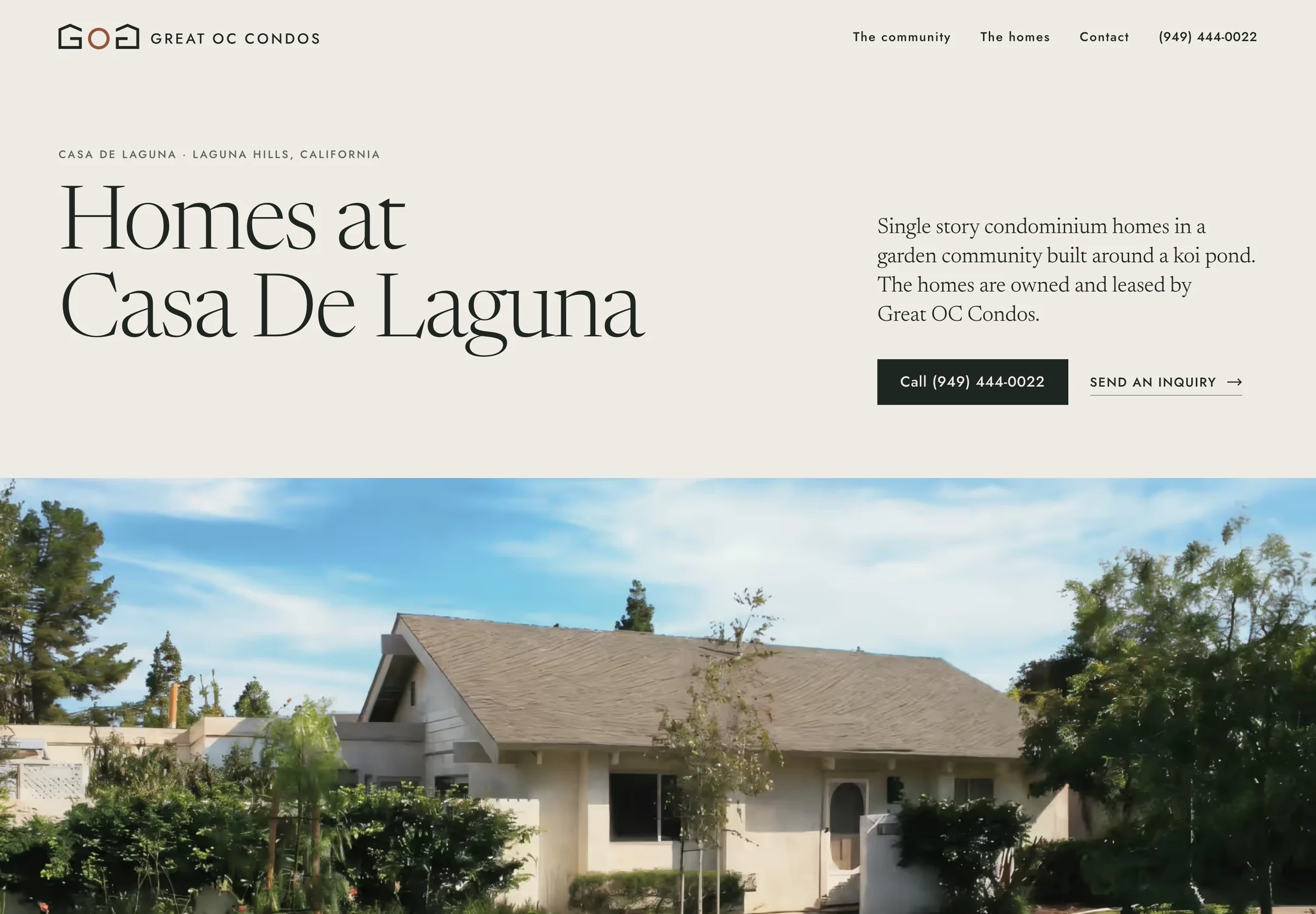
A brand lives or dies at the first real encounter, and in CRE that's almost always the website — the referral checking you out, the owner comparing three firms, the rep verifying you're real. This is where the gap between claimed and actual shows: a firm claiming premium service on a slow template site is contradicting itself in real time. It's the reason we treat the brokerage site as the primary brand asset, not a brochure that happens to be online — and why templates undermine the whole exercise: you cannot differentiate with an asset built for sameness.
Nobody hires a firm because of a logo. But plenty decide against one because everything about its materials said "interchangeable."
Property branding, briefly
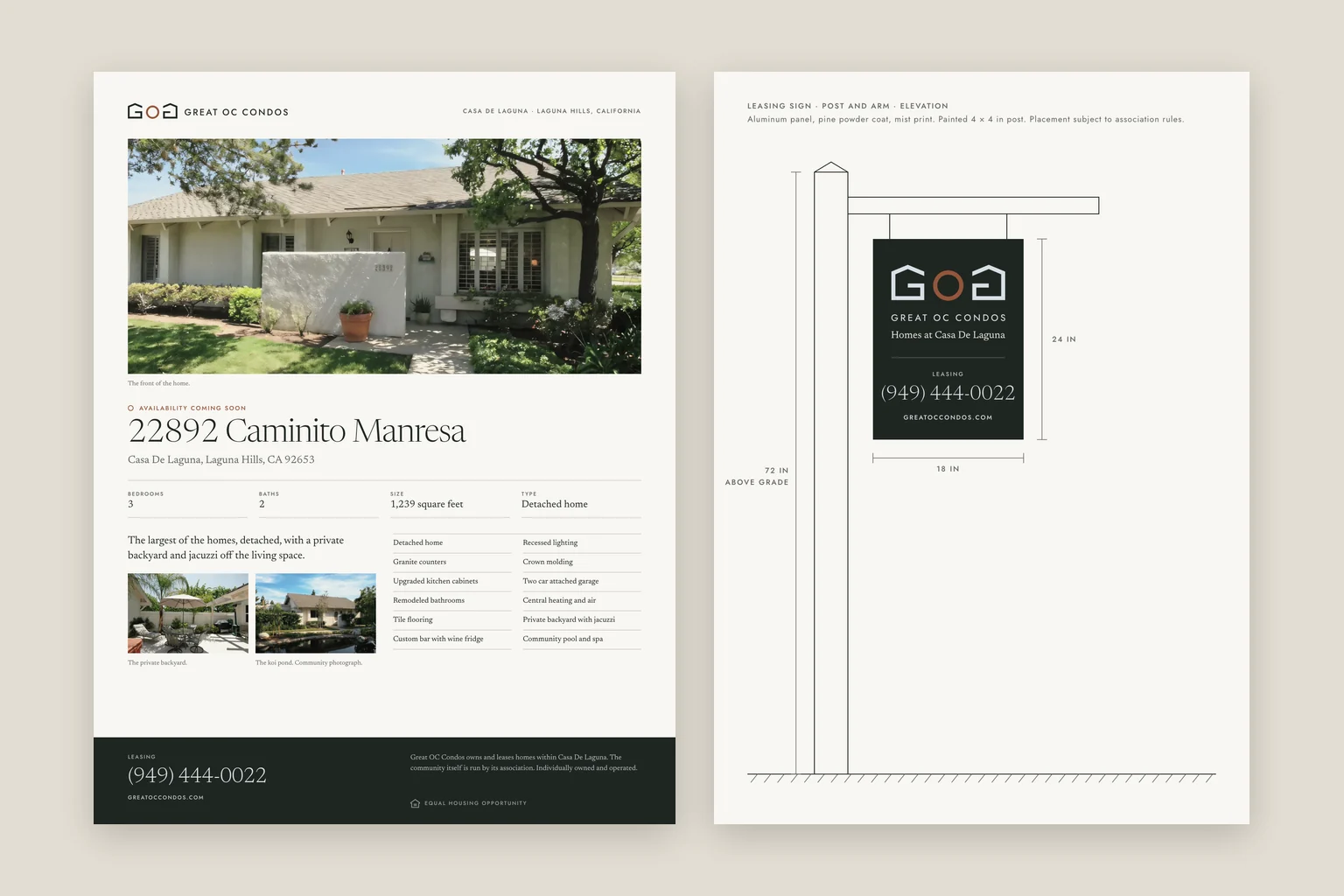
The same logic applies one level down. A center with a name, a consistent look, and its own site is easier to lease and easier to sell than "the strip at Main and 5th" — the brand gives tenant reps, lenders, and buyers a handle for the asset. It costs little (a name, a mark, a design system carried through sign, flyer, and site) and compounds for the life of the ownership.
What to actually do
- Write the three-sentence positioning and cut every claim that couldn't be false.
- Commission one design system — mark, type, color, photo standards — sized to your real needs, not a 90-page brand book.
- Rebuild the website on it first; it's where the brand gets tested.
- Then cascade: flyer, OM, sign, email templates. One system, no exceptions.
Work with Endcap Design
Property branding
We create property names and identities and apply them to the website, brochure, presentation, or signage artwork.
Included
- A naming shortlist when needed, and the selected mark
- Logo variations, color and type specifications, and a concise guide
- Website, brochure, presentation, or signage artwork as agreed; fabrication stays with your sign contractor
“We own ten homes at Casa De Laguna and were still sending people to a site built in 2013. Noah pulled the photos and details out of the old site, designed a logo from the rooflines and the pond, and put the community, the homes and current availability in one place. It’s the first time the website has looked like the place we actually rent.”
Quoted for each property after we review the existing identity and where the design needs to appear
We reply within an hour during business hours, and we only use your details to answer you.
Discuss branding for your propertyOr email Noah at hello@endcap.design
See the full service ↗Contact Endcap
LET’S
talk.
A website, a brand, or a complete set of materials.
We reply within an hour during business hours, and we only use your details to answer you.
Let’s talk or email Noah at hello@endcap.design