Retail centers
Site plans that lease space.
Every center has a site plan. Usually it is a PDF pulled out of an architect's file years ago, with a departed anchor still labeled and a north arrow pointing at the edge of the page. It is also, on nearly every leasing site we build, the element visitors touch most. Here is what that drawing has to do for a tenant, and how to make one that holds up after the rent roll changes.
What a tenant is looking for when they open the plan
Not dimensions. A tenant rep who opens a site plan is answering a short list of spatial questions that no paragraph of copy answers well:
- Where exactly is this space? End cap, mid-inline, rear building, freestanding pad. The answer changes the rent they will accept before they ever ask the rate.
- What flanks it? The two neighbors on either side of a suite matter more to most retail users than the anchor does. A nail salon next to a dry cleaner is a different deal than a nail salon next to a gym.
- How do cars get in, and where do they park? Curb cuts, the drive aisle, whether the parking directly in front of the door is shared with a lunch rush.
- Which way does it face? Street visibility, sun on the patio in the afternoon, whether the storefront is seen from the signalized corner or from the back of the lot.
- Where does the operational stuff live? Trash enclosure, grease interceptor, loading, the utility yard. Restaurant users find this on the plan or they ask, and asking costs a day.
A drawing that answers those five things quickly will do more leasing work than a page of prose about the trade area, which is saying something, because we are fond of the trade area numbers.
Three drawings, three jobs
Most listings publish one drawing and expect it to serve every purpose. It cannot. There are three, and they are not interchangeable:
- The architectural site plan. Dimensioned, to scale, drawn for the city, the architect, and the contractor. Accessible stall counts, setbacks, easements. Necessary, and almost unreadable on a phone.
- The leasing plan. A simplified version of the same geometry: buildings, suite labels, tenant names, availability, parking field, road frontages, north arrow. This is the marketing drawing, and it is the one most centers do not have.
- The annotated aerial. Context rather than geometry: the cross streets, traffic counts with their source and year, the neighbors across the road, the freeway ramp. It answers where the center sits in the corridor, which the leasing plan does not.
Publishing the architectural sheet as your marketing plan is the common shortcut. It reads as effort to the owner and as homework to the tenant.
The label is the product
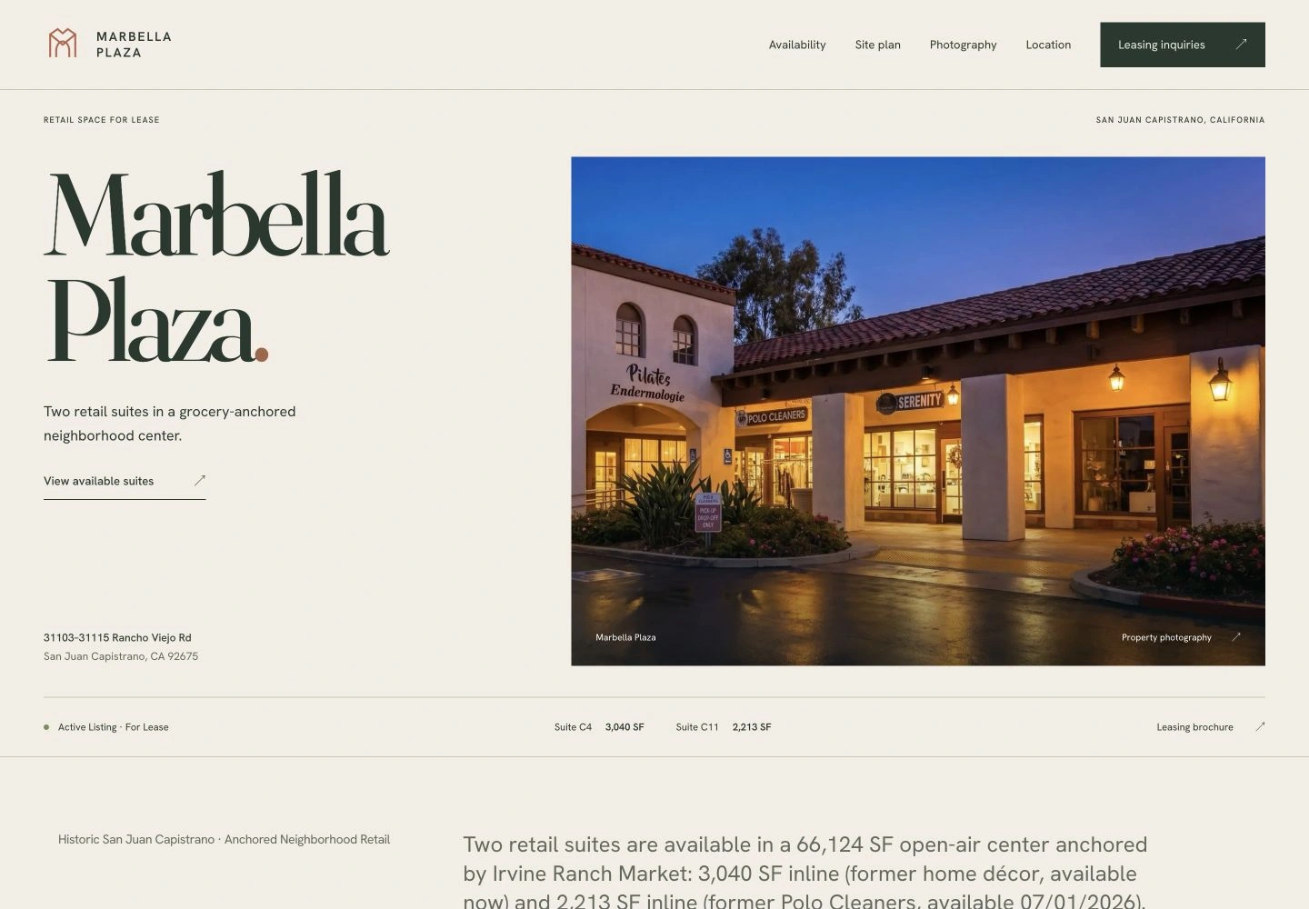
Suite labeling is where these projects quietly succeed or fail. Marbella Plaza, the grocery-anchored center in San Juan Capistrano we built a site for, runs 66,124 square feet across lettered buildings, 27 suites in total: Suite C-7, Suite D-2, Suite G-1. Those labels have to be identical in five places, the rendered plan, the availability table on the site, the flyer, the portal listing, and the rent roll the owner keeps. When they drift, a broker ends up on a call establishing which suite everyone is talking about, and a prospect ends up describing the space as the one next to the sushi restaurant.
Tenant names belong on the leasing plan too, not just the vacancies. Co-tenancy is a large part of the pitch for any multi-tenant center, and a plan that shows only the empty boxes throws away the argument. We keep the roster keyed to the plan so the categories are legible at a glance: grocery, dining, health and wellness, services, kids and learning. More on how that fits the wider campaign in our guide to shopping center marketing.
What interactive should actually mean
Interactive is not a feature, it is a set of behaviors that either save a prospect time or waste it. The ones worth building:
- Tap a suite, get the suite. Square footage, status, rate treatment, photos of that specific space, the floor plan if one exists. One tap, no page reload, no PDF download.
- A link per suite. Every suite should have its own URL, so a broker can send one prospect straight to Suite C-7 rather than to the plan with a note about where to look. That link belongs in the email, the portal listing, and on the sign.
- Filter to what is available. Two states, everything and available. Anything more elaborate goes unused.
- A parallel list. The same information as a plain availability table underneath the drawing, which serves keyboard users, screen readers, and anyone on a phone in a car who does not want to pinch and zoom. Our notes on accessibility for CRE websites cover why the text equivalent is not optional.
The behaviors to skip: hover as the only way to reveal a suite, since touch screens have no hover; hotspots too small for a thumb; a plan exported at print resolution and dropped in as one enormous image. That last one is the most common. Google publishes a Largest Contentful Paint threshold of 2.5 seconds for a good experience in its Core Web Vitals guidance, and a single unoptimized site plan render is often the reason a property page misses it. We wrote up the rest of the usual suspects in page speed for property websites.
A tenant is not leasing a square footage number. They are leasing a specific door, on a specific drive aisle, with a specific neighbor on each side.
Keeping the drawing true
A site plan is a publishing surface, not a graphic. It goes stale the moment a lease is signed, and a plan still showing a tenant who left last spring costs more credibility than having no plan at all, because it tells a tenant rep that nobody is minding the listing.
Two habits fix this. First, one source of truth: the availability data that drives the plan should be the same data that drives the availability table, the flyer, and what gets typed into the portals, so an update happens once instead of four times. Portal records drift fastest and are the easiest to forget, which we get into in portal listing hygiene. Second, date the drawing. A small line reading availability as of a given month is honest, takes ten seconds to maintain, and quietly signals that the rest of the page is current too.
What it takes to produce one
For Marbella Plaza we built a rendered three-dimensional plan of the whole property: all 27 suites, the parking field, and both frontages, Rancho Viejo Road and the I-5. The render was the right call there because the center is multi-building with a wrapped layout, and flat linework does not communicate which storefronts you can see from the road. A prospect looking at it can tell where their space sits and what is on either side of it without reading a caption. The full build is documented in the Marbella case study.
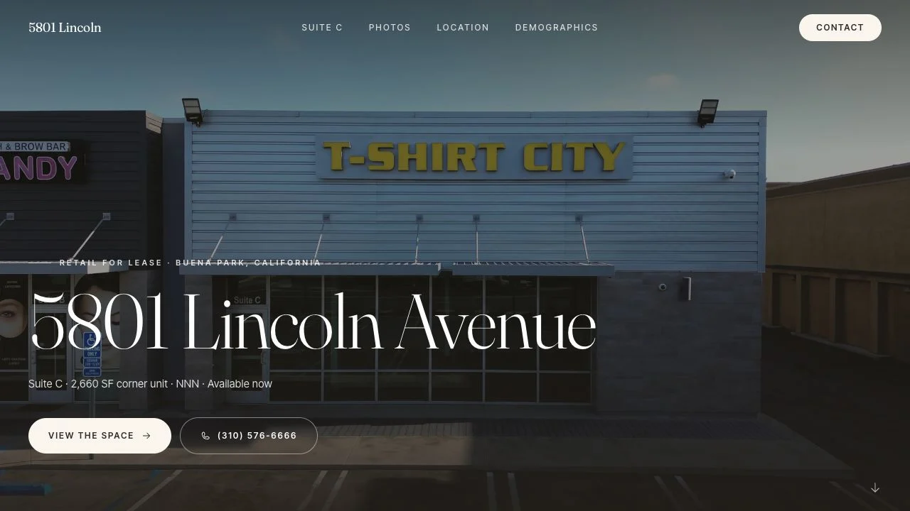
Small properties need the orientation drawing just as much, and usually get less. At 5801 Lincoln Ave in Buena Park, a 2,660 square foot corner suite in a three-tenant strip, the only existing drawings were two architectural sheets from a 2017 renovation. We rotated and cropped them so they read correctly on screen instead of sideways, and paired them with an annotated aerial carrying traffic counts sourced from the City of Buena Park's published GIS layer. That was the whole plan package, produced inside a three-day build we broke down in this post. Three tenants is still an adjacency question.
On cost, the honest range is wide because the input varies. If the owner has current CAD or a clean architectural PDF, redrawing it as a labeled leasing plan is a modest line item. If the drawings are twenty years old, or the center has been reconfigured since, someone has to reconcile the geometry against current aerials first, and that is the real work. A full three-dimensional render sits at the top of the range and earns its place on multi-building centers, ground-up projects, and repositionings where the finished condition does not exist yet to photograph. We quote all of it as one flat number before work starts, which you can read about under services.
The short version
Draw the leasing plan, not the architect's plan. Label every suite the way the rent roll labels it and keep those labels the same everywhere. Put the tenant names on it, because co-tenancy sells. Give each suite its own link. Publish a text version alongside the graphic. Date it, and update it the day the lease signs. None of that is exotic, and it puts a center ahead of most of what a tenant rep opens in a week.
Start a project
Have a center that needs a plan worth sending?
Work with Endcap Design
Property websites
We build a website for one property: your photo gallery, property facts, plans, brochure download, and a broker inquiry form.
Included
- Your photo gallery, property facts, plans, and brochure download
- A broker inquiry form and a layout for desktop and mobile
- Many sites launch in about a week once the material is ready
“We own ten homes at Casa De Laguna and were still sending people to a site built in 2013. [Endcap] pulled the photos and details out of the old site, designed a logo from the rooflines and the pond, and put the community, the homes and current availability in one place. It’s the first time the website has looked like the place we actually rent.”
From $495 for a one-page property website using your approved content · Two revision rounds
We agree on the scope, timing, and price with you before work begins.
Get a quote for a property websiteOr call or text (425) 233-0769
See the full service ↗Contact Endcap
START A
project.
A website, a brochure, or a complete set of materials.
We’ll agree on the scope, timing, and price before starting.
Start a conversation or call or text (425) 233-0769